Mixture Models and Neurotransmitter Release
import numpy as np

def generate_number_releases(size=1):
  return np.random.poisson(lam=2.25, size=size)

def generate_measured_potentials(size=1):
  release_counts = generate_number_releases(size=size)

  measured_potentials = [generate_measured_potential(release_count)
                         for release_count in release_counts]

  return np.asarray(measured_potentials)

def generate_measured_potential(release_count):
  measured_potential = np.sum(0.4 +
			0.065*np.random.standard_normal(size=release_count))

  return measured_potential
Summary
One famous success story of quantitative biology is the experiment that demonstrated that the release of neurotransmitter is quantal: discrete “packets” of neurotransmitter are released at the synapse, rather than a more continuous “stream”.
In this post, I will walk through the mathematical model behind this experiment, using a simple exposition in terms of a probabilistic graphical model. For an introduction to graphical models in the context of information theory and communication, check out this blog post. This post also serves as an introduction to probabilistic models.
I begin with an overview of the context for synaptic transmission and for the experiment that determined it was quantal. Folks who know that background or are uninterested can skip to the Mathematical Model section.
I end with some Python code that generates data according to this model.
Synaptic Transmission
One of the key goals of the nervous system is to communicate information from one place to another: sensory information is relayed from sensory neurons, like those in the eye or the skin, to the neurons of the “thinking” part of the brain, the cortex, resulting in perception. Similarly, information about which muscle cells should contract is relayed from motor neurons in the cortex to those muscle cells, resulting in action. On a smaller scale, information is also transmitted within a single neuron. For example, information about the chemical and pressure signals present at the foot when one steps on a Lego is transmitted from the end of a neuron located in the foot to the end of that neuron located near the spine.
Within a single neuron, information is communicated as an electrical signal, manipulated primarily by proteins called ion channels.
Between neurons, information is (usually) instead communicated as a chemical signal. Connected neurons are separated by small gaps calleD synapses, and they communicate with each other across these gaps by releasing chemicals called neurotransmitters into them, which are detected by receptor proteins. This process is called synaptic transmission, and we now know quite a lot about it.
But, of course, we started out in a state of complete ignorance about synaptic transmission. For example, knowing that neurons communicate with chemical signals, it is unclear how that communication occurs. Is the communication continuous, as in radio, where the signal is a wave varying at each moment in time, or is it discrete, as in internet protocols, where the signal is a “packet” that is sent in a chunk and arrives at a specific moment?
The 1970 Nobel Prize in Physiology or Medicine was awarded to Bernard Katz for convincingly demonstrating that synaptic transmission was, in fact, quantal, or composed of discrete packets of roughly equal size.
In the next section, I will describe the experiment that was performed, and then in the following section, I will describe the generative, probabilistic model of the data, based on the quantal hypothesis, that predicted the results.
The Experiment
The experiment was performed not at the synapse between two neurons, but at the communication point between a neuron and a muscle cell. This neuromuscular junction operates in a manner very similar to a neural synapse, but is larger, and so produces larger signals and is easier to physically manipulate, making experiments easier.
The neuron was stimulated to produce a single action potential, the electrical signal that initiates synaptic transmission. This results in a chemical signal in the synapse that produces an electrical signal in the muscle cell. Because electrical signals are much easier to measure than chemical signals, the electrical output in the muscle cell was measured as a proxy for the chemical input. These electrical signals are called “potentials”.
It was already known that the electrical signal in the muscle cell in response to an action potential in the neuron varied from trial to trial. If transmission was quantal, one would expect part of this variability to be due to the number of packets sent, and part of it to be due to the size of the packets. The probabilistic model below makes these ideas precise, but before moving on, we need to consider one other part of the experiment.
Even when the neuron was not being stimulated, the muscle cell would occasionally show small electrical signals, known as miniature potentials, or minis. By simultaneously recording the electrical activity of the neuron and the muscle cell, it had been demonstrated that these weren’t due to activity in the neuron.
Reasoning from the quantal hypothesis, Katz and colleagues inferred that these events were due to accidental release of individual packets from the neuron. One piece of independent evidence that these events were random was that their frequency increased slightly as the temperature went up, even though the neurons weren’t sensitive to temperature, suggesting that they were due to the random jostling of molecular motion.
Therefore, if their hypothesis was correct, they could measure the minis to learn what the release of a single packet looked like.
The Mathematical Model: Poisson-Weighted Mixture-of-Gaussians
The mathematical model that is used to validate the quantal hypothesis is a probabilistic model. A probabilistic model is a model that attempts to explain the structure of data, taking into account various sources of randomness.
For example, I might develop a probabilistic model of my commute time to work by breaking it down into a two random variables: whether I make the bus or not and then two different distributions for my commute time, given that I did or did not catch the bus. This is known as a mixture model, since it says that the data I observed, my commute times, was a mixture of multiple simpler data distributions.
In neuroscience, mixture models show up in spike-sorting. In spike-sorting, our goal is to determine which action potentials, or “spikes”, came from which neurons by looking at their shapes. To solve this problem, we state that the distribution of action potential shapes that we observed is actually a combination of distributions of shapes, where each neuron from which we record contributes one distribution of shapes. This is a specific example of a clustering problem, which may be more familiar to non-neuroscientists.
A probabilistic model is good when it predicts data that looks like what we actually see. In statistical hypothesis testing, we propose a probabilistic model of the data called the null hypothesis and we reject it if the data we see in our experiment doesn’t look like the data we’d see if the null hypothesis were true.
The probabilistic model of quantal release appears below as a graphical model. In a graphical model, each random variable appears as a node in a graph, and an edge is drawn wherever a random variable can be written as conditionally dependent on another, with the arrow pointing to the dependent variable. Graphical models are, at their core, “just” an intuitive and visual way of describing joint probability distributions, or probability distributions over multiple random variables. For a review of probability, see this blog post. For a thorough introduction to graphical models, see this monograph.
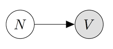
Here \(N\) is the random variable corresponding to the \(N\)umber of release events, or the number of packets sent from the neuron to the muscle, while \(V\) is the \(V\)oltage measured in the muscle cell (in milliVolts). Importantly, the number of release events is not something we can directly observe (otherwise the quantal hypothesis would be obvious!), and so it is what we call a hidden or latent variable. This graphical model expresses that we’d like to understand the data that we do see, \(V\), as being dependent (hopefully in a simple way) on data we did not observe, \(N\).
This probabilistic model is intended to specify a joint probability distribution, or an assignment of a probability to each pair of events “there were \(k\) packets released” and “I recorded \(v\) millivolts in the muscle cell”, written mathematically as \(p(N=k,V=v)\). By writing the graphical model with the arrow pointing from \(N\) to \(V\), we are saying that we want to write this joint distribution as
\[p(N=k,V=v) = p(V=V\lvert N=k)\cdot p(N=k)\]where the vertical bar \(\lvert\) is pronounced “given” stands for probabilistic conditioning. If this is unfamiliar, see this blog post for a review of probability notions.
So to complete our probabilistic model, we need to specify \(p(N=k)\) and \(p(V=v\lvert N=k)\) for each \(k\).
For \(p(N)\), the right answer turns out to be a Poisson distribution. The short explanation of why is that our model for quantal release is that there is a large “pool” of available packets – large relative to the number of packets released at once – and each one only has a very very small probability of being released. Starting from the binomial distribution, which expresses the chance that a certain number of events occur if we try more than once, (think number of heads if we toss a coin multiple times), we can derive the Poisson distribution as the limit when the chance is going to \(0\) and the number of tries is going to \(\infty\). See this set of notes for mathematical details (bonus: it’s in the context of neurotransmitter release).
The precise mathematical form is not important. All that matters is the basic shape, which you can see in the image below.
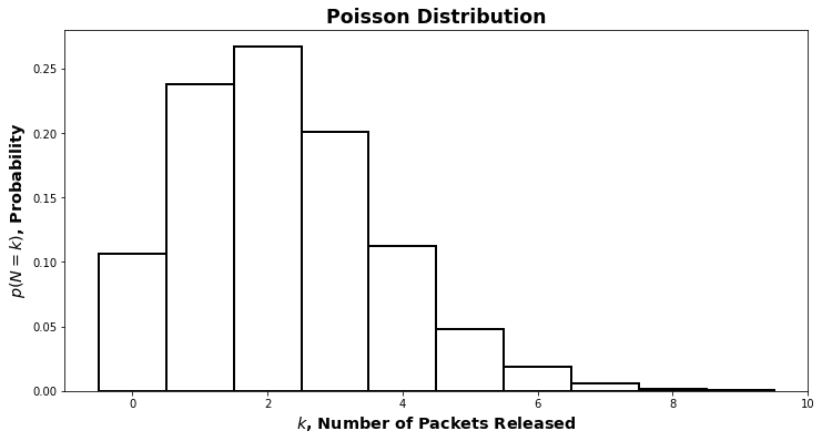
Poisson distributions have one parameter: the rate, \(\lambda\). To complete our specification of the graphical model, we’d have to also choose a value for \(\lambda\). For now, we’ll hold off on that and say that
\[N\sim \text{Pois}(\lambda)\]which is pronounced “\(N\) is distributed according to the Poisson distribution with parameter \(\lambda\)”.
What about for \(p(V\lvert N)\)? By measuring the minis, we get a distribution for \(p(V\lvert N=1)\). Lo and behold, it is the perennial friend of statisticians and scientists, the Gaussian distribution, also known as the “bell curve”.
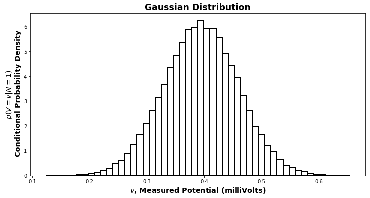
The topic of why a Gaussian distribution appears here is too much to go into in this context. The direct answer is that the central limit theorem holds. An indirect but complete answer would start with the definitions of \(\pi\) and \(\mathrm{e}\). A Gaussian has two parameters: the mean, \(\mu\), and the variance, \(\sigma^2\) (\(\sigma\) without the \(^2\) is the standard deviation).
By measuring the miniature potentials, we can determine the values of \(\mu_1\) and \(\sigma^2_1\), the mean and variance for the Gaussian distribution of \(p(V\lvert N=1)\). They are just the mean and variance of the data we observed. We can write this
\[(V\lvert N=1) \sim \mathcal{N}(\mu_1,\sigma^2_1)\]which is pronounced “given that the number of packets released is \(1\), the voltage is distributed as a Gaussian with mean \(\mu_1\) and variance \(\sigma^2_1\)”.
What about when \(N\neq 1\)? If we assume that the voltage we measure when there are \(k\) packets released is simply the sum of the \(k\) voltage changes caused by each individual packet, then we can determine the rest of the conditional distributions for \(V\) given \(N\).
If we make the assumption above, then
\[(V\lvert N=k) \sim \mathcal{N}(\mu_k, \sigma^2_k)\\ \mu_k = k\cdot\mu_1\\ \sigma^2_k = k\cdot\sigma^2_1\]and we’ve completely specified the joint distribution of \(N\) and \(V\) (once we’ve chosen a value for \(\lambda\).)
From that joint distribution, we can determine the distribution of just the data we observed, the voltage. This distribution is called the marginal distribution of the voltage and the process of computing the marginal distribution is called marginalization. We compute the marginal probability \(p(V=v)\) by adding up \(p(V=v,N=k)\) for all \(k\), as shown below. We can also use the rules of conditional probability to express the joint probability in terms of the two pieces we constructed above: the marginal probability that there are \(k\) releases and the conditional probability that there the measured voltage is \(v\) if there are \(k\) releases.
\(\begin{align} p(V) &= \sum_{k=1}^\infty p(V,N=k) \\ &= \sum_{k=1}^\infty p(V\lvert N=k)p(N=k) \end{align}\)
This second way of writing the probability of our data emphasizes the “mixture” aspect of our model: the distribution of the data that we observed is a weighted sum, or mixture, of the conditional distributions \(p(V\lvert N)\). Because each of the components being mixed together is a Gaussian, this model is called a mixture-of-Gaussians model. Because the weights, or mixture amounts, are given by a Poisson distribution, this is a Poisson-weighted mixture-of-Gaussians model.
Determining Success
The proper way to determine whether a model is a good one is to calculate the likelihood of that model. The likelihood is calculated by evaluating \(p(V=v)\) for each of the \(v\) values that we measured. If the average of these values is large, then the model is good. (The likelihood also gives us a way to pick \(\lambda\): we choose the one that makes the likelihood the biggest. This is called maximum likelihood estimation). We might want to compare this likelihood to the likelihood of an alternative model, and the model with the highest likelihood wins.
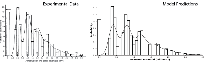
In this case, however, the model is so good, there’s an easier way to show that it works. We simply simulate data according to the model and compare it, by eye, to real data. The result is extremely convincing!
The Python code below will generate data according to the Poisson-weighted mixture-of-Gaussians model described above, with the Gaussian parameters chosen to match those of the recorded data for minis and the \(\lambda\) value chosen (by hand) to approximately maximize the likelihood.
import numpy as np

def generate_number_releases(size=1):
  return np.random.poisson(lam=2.25,size=size)

def generate_measured_potentials(size=1):
  release_counts = generate_number_releases(size=size)

  measured_potentials = [generate_measured_potential(release_count)
                         for release_count in release_counts]

  return np.asarray(measured_potentials)

def generate_measured_potential(release_count):
  measured_potential = np.sum(0.4 +
			0.065*np.random.standard_normal(size=release_count))

  return measured_potential
The results are striking. The figure on the left below shows the results of an experiment measuring muscle cell potentials, along with the predictions of their model (taken from Figure 8 of Boyd and Martin, 1956). The figure on the right shows a histogram of the results of the simulation specified above, which closely match the data on left, along with a kernel density estimation of the data, which closely matches the model on the left.
Acknowledgements
I’d like to thank Neha Wadia, my collaborator and partner in crime, for bringing this model to my attention and helping me see it in a new light.